Home » Posts tagged 'ux'
Tag Archives: ux
New look for OneSearch!
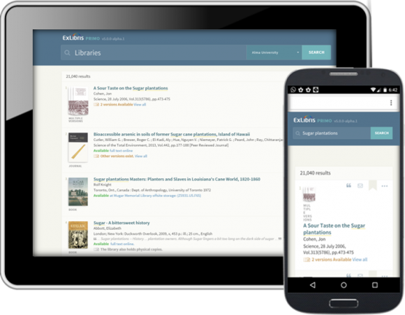 If you haven’t already heard, OneSearch is getting a facelift! In the fall semester, OneSearch will have a brand new user interface following a CUNY-wide rollout in late August.
The librarians serving on the OLS Public Services Committee have been working on the new UI over the last few months and we are eager to share our work with you! If you haven’t seen it already, take a look at your college’s instance of the new OneSearch interface:
- Baruch College
- Borough of Manhattan Community College
- Bronx Community College
- Brooklyn College
- City College
- College of Staten Island
- CUNY Graduate Center
- CUNY Graduate School of Journalism
- CUNY School of Law
- Guttman Community College
- Hostos Community College
- Hunter College
- John Jay College of Criminal Justice
- Kingsborough Community College
- LaGuardia Community College
- Lehman College
- Medgar Evers College
- New York City College of Technology
- Queens College
- Queensborough Community College
- York College
Take this opportunity to get familiar with the new design. Notice how the interface is cleaner and the searching experience calmer. Content is displayed only when you need it. We really think you’re going to love this new design!
If you find anything amiss, please get in touch with your library—who will, in turn, inform the local Public Services Committee representative. The summer months will be dedicated to refining the new design before it goes live on Friday, August 25, 2017.
Coming soon to OneSearch: New UI!
Applying the principles of user experience to their findings from user studies and search log analyses, Ex Libris will soon release a new user interface for their discovery system, Primo (aka “OneSearch”). What does this mean for the students, staff, and faculty members of CUNY?
Consistent experience across platforms

One of the key advantages of the new UI is the way it displays on mobile and tablet devices, making OneSearch accessible from any device, any time.
Clean and intuitive interface
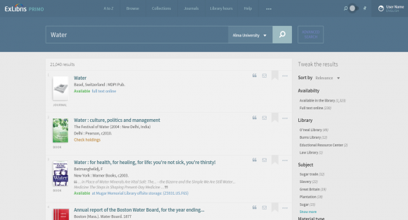
The interface of the result list is clean, presenting only data that can help the user easily determine which item to select. If the full text is available, a full-text link is positioned with the item in the result list.
Note the row of icons to the right of each item. Anticipating the user’s next actions, these icons lead directly to the action menu.
Improved “Actions” menu
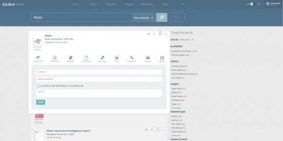
The action menu is one click from the result list. It enables users to perform actions such as viewing information about an item, sending the information to themselves or a colleague, adding the item to their list of favorites, and saving the item in a reference tool.
Gradual exposure of information
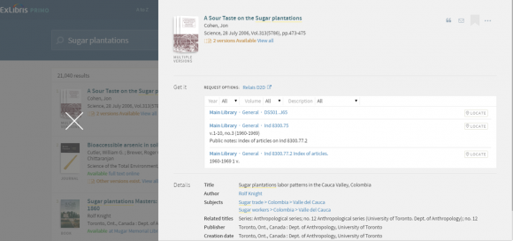
Once the user selects an item, all the available information about it appears.
Seamless “Favorites” (aka “E-Shelf”) experience
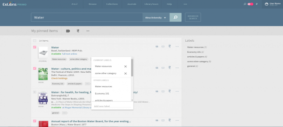
The list of favorites has the same look and feel—and provides the same information and action icons—as the result list.
Want to know more about the rationale and reasoning behind the vendor’s decisions? Check out Core Principles for Designing Library Discovery Services (PDF), a white paper released by Ex Libris in November 2015.
The new UI will be available in August 2016. However, the CUNY Libraries will not implement the new design in OneSearch until extensive testing and customizations have been done. The Office of Library Services offers Spring 2017 as a projected date for the new UI rollout at CUNY.
In the meantime, you can check out the preview of the new design in the OneSearch sandbox environment. Please remember that this preview is just that: a preview! It is still in development. (The vendor has made it available for customers to review the proposed changes.) It is best viewed in the Chrome browser.

